
The forum shirt design thread


Thread Starter
Senior Member
MotoGP
Joined: Jul 2010
Posts: 3,871
From: Phoenix, AZ

The forum shirt design thread
Hi folks. Here we will get this years design set so Jason can start getting us shirts! If you have an idea or really like a design of a shirt, or just a suggestion to make one better, be verbal. Shoot, if you design one yourself, throw it in here. We're going to try to get this done in a reasonable timeframe, and here are the general restrictions:
1) Aiming to stick to one design this year. Possibly even one shirt color? This means that as we discuss designs, we will hopefully narrow it down. According to choice overload theory, you will be happier with one shirt option to purchase at the end.
2) Limited to three colors (four if you count the shirt). The screenprinting process has it's quirks. Also, blending is nearly impossible to do (unless it's just a fade across). It's not a super precise process, but allows for blocks of color, relatively fast print time and is fairly inexpensive.
A couple of thoughts as well: The final design I will clean up, spend some time making it look a little better (consider these rough drafts), and prep for the screenprinting process. I am also open to putting a VTR1000F logo to make it more friendly to overseas buyers. We're still mixing ingredients here, nothing's baked yet.
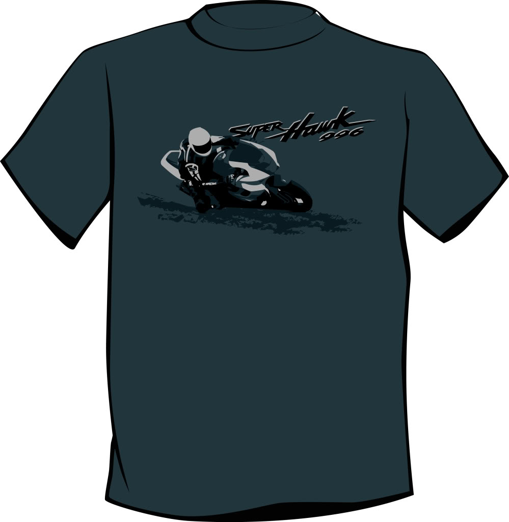
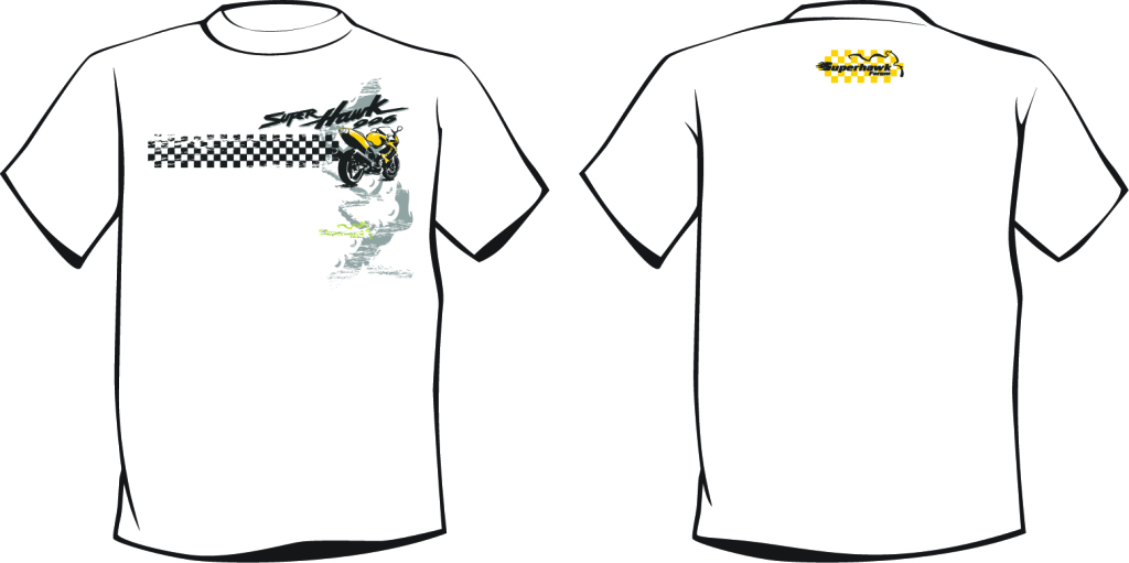
Here's where it's at right now:
1) Aiming to stick to one design this year. Possibly even one shirt color? This means that as we discuss designs, we will hopefully narrow it down. According to choice overload theory, you will be happier with one shirt option to purchase at the end.
2) Limited to three colors (four if you count the shirt). The screenprinting process has it's quirks. Also, blending is nearly impossible to do (unless it's just a fade across). It's not a super precise process, but allows for blocks of color, relatively fast print time and is fairly inexpensive.
A couple of thoughts as well: The final design I will clean up, spend some time making it look a little better (consider these rough drafts), and prep for the screenprinting process. I am also open to putting a VTR1000F logo to make it more friendly to overseas buyers. We're still mixing ingredients here, nothing's baked yet.
Here's where it's at right now:


Member
Squid
Squid
Joined: Jan 2012
Posts: 45
From: Wisconsin
Hey, I think the first one is the better one. Using the second shirts back in the first ones colour scheme would be a good combo. How about taking the superhawk name out and insert, VTR/F, and then leave the 996 where it is. Just another thought to address the differences between here and there. Otherwise I would be up for the VTR1000F only.


Old and dangerous
SuperSport
SuperSport
Joined: Jan 2012
Posts: 604
From: DFW Texas
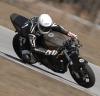
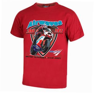
I like them both. Definitely the second one, if you could opt for the faster red color (not to mention more attractive to the opposite sex). The 1st one is pretty great too. However, even though we may be limited to one design, I think we should allow both model names. The SuperHawk 996 or FireStorm 996 designations are so much cooler than the generic VTR1000F or VTR/F 996. It would be nice to have a choice. I don't know which name the most VTR1000F's wear, but I would rather display FireStorm 996 instead of VTR... even though I have a SuperHawk. 

Senior Member
SuperBike
Joined: Aug 2005
Posts: 1,864
From: Fort Wayne, IN
I'm not wild about either, I prefer last years too. I like a big design on the back with something small on the front. If the main design is on the froint it looks cheap to me (just my opinion, not trying to hate!). Maybe the small logo of the second design with the first design on the back?
Senior Member
MotoGP
Joined: Sep 2006
Posts: 4,138
From: Austin, Tx
Here's a thought. Maybe we choose one new design and do a reprint of one of the designs from last year. All the setup it done for those shirts - should be easy enough unless I'm missing something about the process. Use the same parameters for both shirts - one shirt base color with the graphic printed in one color.

Moderator
MotoGP
Joined: Jul 2007
Posts: 5,225
From: Gettysburg, Pa
Ian, I like both. The first design looks great w/ the Superhawk 996 just as you have it (I don't own a Firestorm)
Here is one:
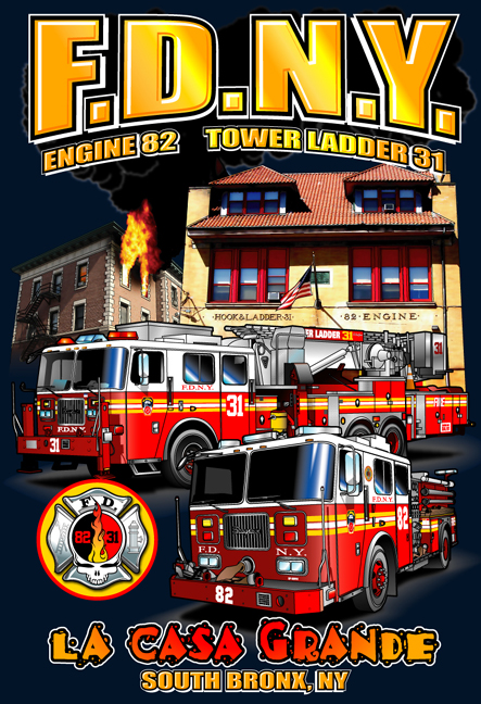
I've seen Ryan do shirts just like those for local houses. They turn out very nice.
I'm not saying design a shirt like that. I'm just letting you know you can use full color. Do that first one up w/ some 4 color process (cmyk)and lets see what it looks like (for ***** and giggles).
SportTouring
Superstock
Joined: Aug 2006
Posts: 274
From: Hawaii
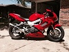
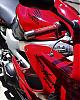
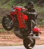
I would go with the second design. As mentioned previously,
the smaller design with the forum name on the front to signify
the group. And on the back, what we enjoy. Maybe a larger
picture, S/H and rider going thru some tight turns with some
front wheel lift after exiting? Current pic is also fine!
the smaller design with the forum name on the front to signify
the group. And on the back, what we enjoy. Maybe a larger
picture, S/H and rider going thru some tight turns with some
front wheel lift after exiting? Current pic is also fine!

Senior Member
SuperSport
Joined: Apr 2011
Posts: 510
From: Edwards AFB, CA
I would go with the second design. As mentioned previously,
the smaller design with the forum name on the front to signify
the group. And on the back, what we enjoy. Maybe a larger
picture, S/H and rider going thru some tight turns with some
front wheel lift after exiting? Current pic is also fine!
the smaller design with the forum name on the front to signify
the group. And on the back, what we enjoy. Maybe a larger
picture, S/H and rider going thru some tight turns with some
front wheel lift after exiting? Current pic is also fine!


Thread Starter
Senior Member
MotoGP
Joined: Jul 2010
Posts: 3,871
From: Phoenix, AZ
Jason... I had no idea that it was possible to screen print graphics in that way... going to have to do a little research to see how that works and what is possible...
I've been manually putting in all of the color blocks on these... it would take a ridiculous amount of time to do that firetruck shirt. But maybe Ryan's process is one that I'm unfamaliar with (the screen printing that I've done was probably 1950's technology)
Last edited by 7moore7; Jan 12, 2012 at 07:54 AM.

Member
Squid
Joined: Apr 2009
Posts: 35
From: Montana
I think having a small logo on the front left breast and large action shot (like JaimeDaugherty, Onomea and Squid mentioned) on the back looks better. Since this is the Superhawk Forum, I would say that's what should be on the shirt.
Just my two cents....
Just my two cents....
Moderator
MotoGP
Joined: Jul 2007
Posts: 5,225
From: Gettysburg, Pa
I'm going to stop by the shop tomorrow and make sure I'm not a liar. He does those style shirts all the time and he does them well.
Moderator
MotoGP
Joined: Jul 2007
Posts: 5,225
From: Gettysburg, Pa
Ian, I stopped by and talked to Ryan this morning. He doesn't usually work in cmyk. He can if it's on a white shirt. Don't worry so much about the break downs. He uses simulated cmyk if you wondered. His new machine is an 8 head. He said if we're going to do one shirt you can make it as colorful as you want. Here's an idea. If we do that first design, say on a charcoal shirt (one color choice only), that would really make it easier for me to offer 2 shirt designs. I would need a minimum of 10 shirts though.
Here's some more ideas:


Here's some more ideas:
Thread Starter
Senior Member
MotoGP
Joined: Jul 2010
Posts: 3,871
From: Phoenix, AZ
Holy smokes, I shouldn't have been restraining. Looks like he can do some pretty cool stuff.
Also, it sounds like he has all the capabilities to draw the separate colors from the graphics. For some reason I was worried about needing to do this... almsot like I was going to be making the shirts or something and not a pro!
For those interested, the process looks something similar to this:
Printing 4 color t-shirts on white simulated process with CMYK inks - YouTube
and, yes, I picked the vid for the music.
On a similar note, that Hypermotard shirt is way sick. I love graphics like that. Is Ryan willing to print all the way to the bottom? I would think it would be harder to do on a size run but so far I've been very wrong on everything else he can do!
Moderator
MotoGP
Joined: Jul 2007
Posts: 5,225
From: Gettysburg, Pa
Remember these?


Cool vid for someone who has never saw t-shirt printing before. I like the music too.


